Product Updates
Dashboard Visual Refresh
July 7, 2025
4
min read
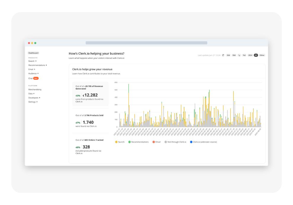
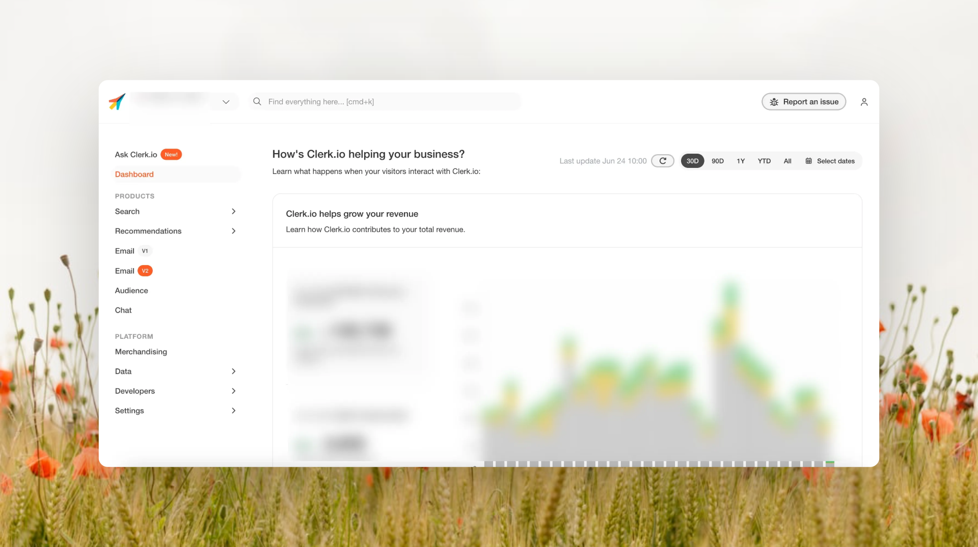
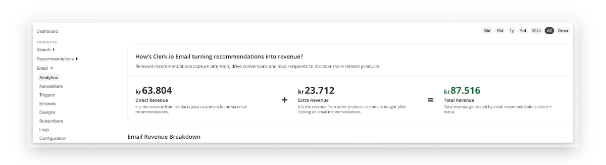
Dashboard Visual Refresh
What’s Changing
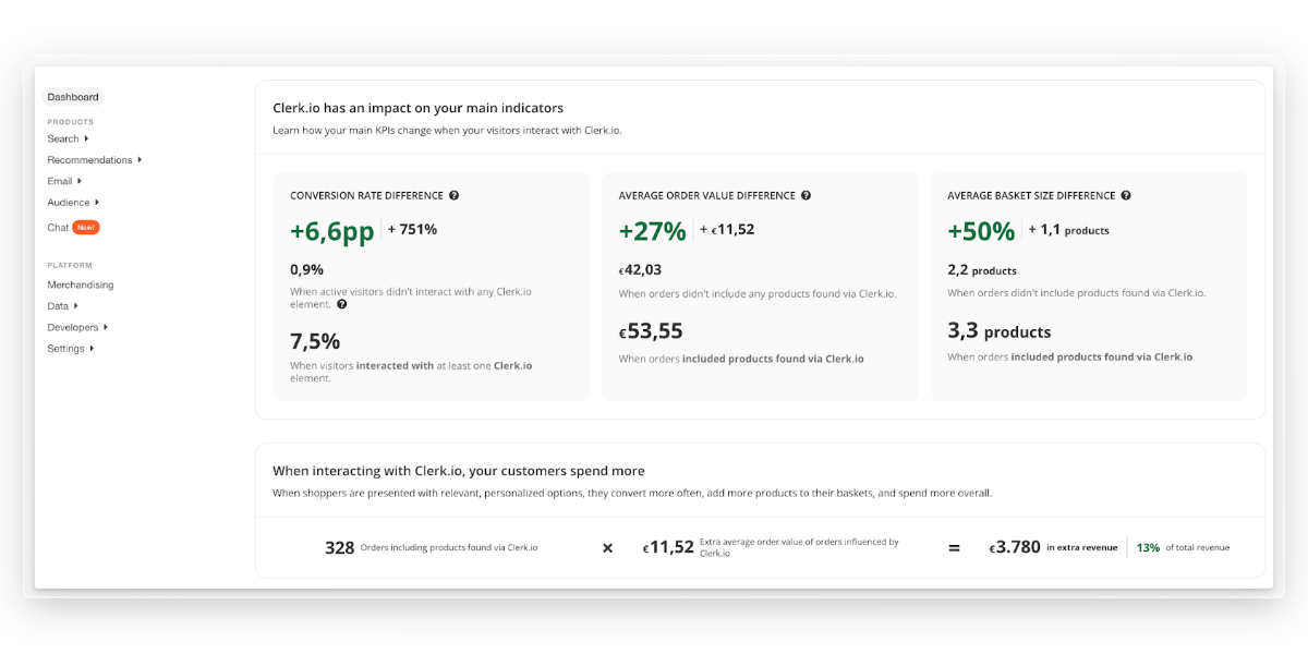
- Improved header typography and description copy for faster at-a-glance understanding
- KPIs are now segmented into logical blocks to sharpen visual hierarchy
- Brand-new “Top 10 % Benchmark” comparison table at the bottom of the main dashboard lets you quickly see how your metrics stack up against high-performing Clerk.io users
- A handful of smaller polish tweaks across colors, spacing and iconography
Heads-up
- These changes do not include the upcoming Chat Analytics revamp—stay tuned for that release.
- Example screenshots you may have seen use test data; your live numbers will, of course, differ.
Enjoy the clearer view! If you have feedback after the rollout, we’re all ears.


Book a FREE website review
Have one of our conversion rate experts personally assess your online store and jump on call with you to share their best advice.
Thank you! Your submission has been received!
Oops! Something went wrong while submitting the form.