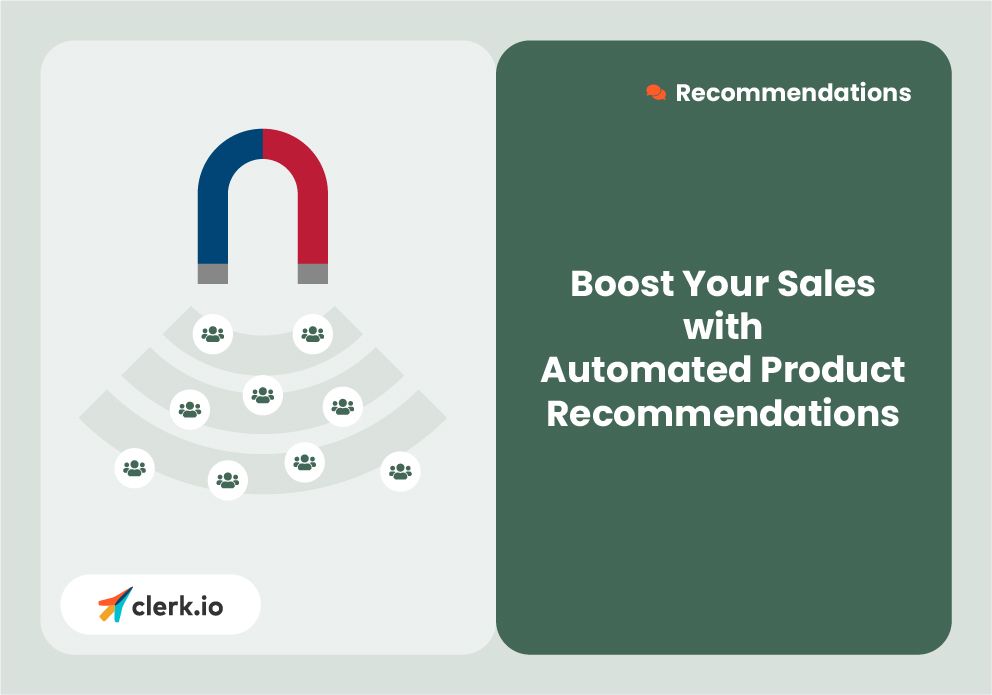
Best Practices to Boost Your Sales with Automated Product Recommendations

You know that inspiring customers to make a purchase is vital for success in this fast-paced and ever-expanding world of e-commerce.
However, to really maximize your profitability, it's also equally important to ensure that they buy more than one product per order because a webstore’s expenses, such as marketing, shipping, and all other associated costs, tend to be paid through the first product a customer buys.
If all your customers only purchase one product each, there really isn’t much left for you afterward. It’s not uncommon that these cross-sell products make up only 10% of total sales but close to 50% of your bottom line.
To achieve a larger basket size per customer, your webstore must leverage the power of automated product discovery!
In this blog post, we'll explore:
- How our Recommendations tool offers a comprehensive solution for automating product recommendations
- Which pages to use recommendations on throughout your webshop
- How to create highly converting banner designs to match your brand
- How to use Recommendations insights to identify which logics to focus on for growing your business
How you can optimize your recommendations with these key pages:
At Clerk, we understand the significance of strategic product placement, which is why our Recommendations tool delivers a diverse range of product logics to optimize your different webshop pages.
Since online consumers often navigate chaotically, going back and forth between many pages, providing interesting content on every page is crucial.
Let's delve into the most important pages and their respective recommendations.
1. Homepage:
- Consider the homepage as the storefront of a physical store:it must be eye-catching and exciting enough to garner interest from a customer.
- And you can personalize this page based on a visitor’s browsing history.
- Using these visitor recommendations, you can reflect their interests and display relevant products. For example, if a customer is interested in skincare, the homepage could display moisturizers or serums to get them started on their shopping journey.
- Additionally, you should feature Bestsellers and Hot Products to open up your catalog, capturing attention and encouraging further exploration.

2. Category Page:
- Large category pages with hundreds or even thousands of products will instantly overwhelm your consumers. And with today’s average attention span, your customers will quickly look elsewhere.
- This is why we recommend using social proof through Bestsellers or Trends within each category. So even if a customer knows next to nothing about a product, they can begin their search by understanding the core products.
- Displaying popular items in the category helps visitors make informed choices, leading to increased conversions.'

3. Product Page:
- The product page is, of course, one of, if not, the most crucial page in the buying journey: it’s where your customers will actually purchase from.
- If a customer has found a product page, there could be several thoughts they may have. The first being: “Great, this is the product I want; now I would like some accessories”. The second being: “This is not the right product.”
- We cater to both these mindsets with alternatives and cross-sell products on the same page.
- Alternatives will showcase similar products, catering to customers who haven't found their ideal item. This dramatically helps your conversion rates while lowering bounce rates, so these potential customers stay on your webstore.
- Cross-selling, on the other hand, suggests additional products to increase the average basket size, thereby boosting your revenue. And customers do tend to prefer spending a little more for products so that they can one order rather than several from the same webstore.

4. Add-To-Cart Step:
- Adding an intermediate step, known as the Add-To-Cart step, bridges the gap between the product page and the shopping cart.
- Amazon has been using this step for years and to great success.
- The add-to-cart step serves 3 key purposes.
- 1. It visually acknowledges that a product has been added to cart.
- 2. Provides an easy journey towards the cart.
- 3. Displays the next best products to purchase.
- This is why we recommend displaying four banners in a specific order:
- 1. Best cross-sell for the product just added to cart
- 2. Visitor recommendations based on session browsing
- 3. Bestsellers or hot products
- 4. Current best offers.

5. Cart Page:
- Similar to the gum, candy, and chocolate strategically placed by supermarket counters, we suggest placing cross-sell banners on your actual cart page!
- These banners automatically select affordable additional items based on the cart's contents, helping to tempt customers into making spontaneous purchases.

6. Content Pages:
- Even content pages, such as blogs and articles, present opportunities for conversions.
- You spend large amounts of time creating and writing blogs, so make sure you’re getting the most out of them with continuously updated product recommendations.
- Our content Related Products feature identifies the post's topic and displays relevant products, allowing readers to easily purchase directly from your blogs and helping you generate additional revenue.

Why design considerations are so important:
To ensure the effectiveness of recommendations on your page, you really need to emphasize visibility. Placing banners strategically throughout the webshop, rather than burying them at the bottom of the page will, of course, increase customer engagement.
Additionally, make sure you really visualize the most important details of each product through the use of high-resolution images and clear product details, such as name and price, alongside a call-to-action button. A recommendations slider design that aligns with your brand's colors and fonts will further enhance the user experience.
We highly recommend using a slider design where each click on a navigation arrow shows a full new set of products. What does this mean? If you aredisplaying 5 products at a time, make sure to load at least 15 products so customers can click and see 3 sets of products. This is not the end-all approach, but just a rule of thumb.
How to analyze and optimize your webstore:
While our recommendations automatically adapt to your customer’s behavior, analyzing individual banner performance is crucial for growth.
Recommendations Insights offers valuable insights into banner views, revenue, and ROI, allowing you to identify optimization opportunities. We recommend checking this at least once a month to stay on top of your optimization.
Perhaps your homepage recommendations are incredibly popular, but your add-to-cart cross-selling might need some fixing.
By monitoring these metrics regularly, you can continuously refine and improve your product recommendations.
Conclusion:
With our best practices for automated product recommendations, your business can significantly enhance its conversion rates and increase average basket sizes.
With tailored recommendations for each page, a focus on visibility and engaging design, and the ability to analyze and optimize performance, you work smarter, not harder. Cliche, we know, but it really is true.
Want to unlock the potential to attract, convert, and retain customers more effectively through recommendations? Click below.

Book a FREE website review
Have one of our conversion rate experts personally assess your online store and jump on call with you to share their best advice.


