 September 4, 2026
 13 min read
The strongest Shopify fashion stores turn a large, fast-changing catalog into a short path from inspiration to a confident choice. Seven examples worth studying are Gymshark, SKIMS, Good American, Rothy’s, Fashion Nova, Allbirds, and Munk Store.
Each store solves a different fashion-shopping problem. Gymshark organizes products by activity and fit. SKIMS sells through needs, fabrics, and fit guidance. Good American makes body and length choices part of navigation. Rothy’s keeps a wide audience catalog orderly. Fashion Nova supports trend-led browsing and visual search. Allbirds uses a restrained structure around product families. Munk Store connects discovery with personalized search and recommendations.
This review is based on each live storefront and its public Shopify assets, checked on September 4, 2026. It evaluates visible navigation, discovery, merchandising, localization, and accessibility cues. It does not rank the brands by sales, design awards, or private conversion data.
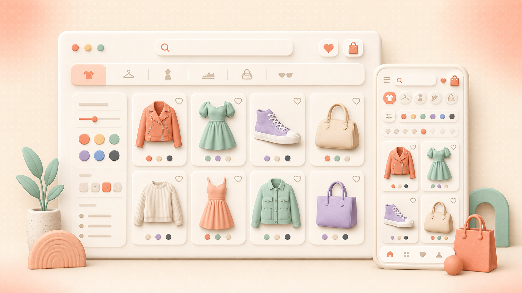
Quick comparison: seven Shopify fashion UX examples
| Shopify store | Best UX lesson | Live evidence reviewed | What a smaller store can copy |
|---|---|---|---|
| Gymshark | Organize by shopper goal, not only product type | Activity-led collections, product-fit labels, ratings, wishlists, category guides, and Shopify storefront assets | Add an activity or occasion path beside the standard category tree |
| SKIMS | Turn fit uncertainty into guided discovery | Bra and shapewear guides, a bra size calculator, fabric collections, matching sets, bundles, and Shopify Oxygen assets | Create one high-intent fit guide and link it from navigation and product pages |
| Good American | Make inclusivity a usable navigation system | Petite, long, rise, silhouette, fabric, and stretch-led denim routes, plus shoppable looks and Shopify assets | Expose the attributes shoppers use to describe their bodies and preferred fit |
| Rothy’s | Keep a broad catalog predictable | Clear audience and product-type menus, named collections, country selection, search, and Shopify storefront assets | Use the same menu grammar across women, men, kids, and accessories |
| Fashion Nova | Join trend discovery with direct product finding | Audience-first entry points, trend edits, deals, text search, image search, and Shopify Oxygen assets | Pair campaign collections with strong search and category shortcuts |
| Allbirds | Reduce choice friction with a restrained structure | Men and women paths, product-family navigation, color choices on cards, seasonal edits, accessible controls, and Shopify assets | Limit top-level choices, then reveal the useful product attributes one layer down |
| Munk Store | Personalize discovery across a multi-brand fashion catalog | Live Shopify assets plus a Clerk.io customer story covering search, recommendations, filtering, and measured outcomes | Connect availability-aware search with complete-the-look recommendations |
None of these layouts should be copied pixel for pixel. Copy the decision model: which question does the interface answer, and how much work does it remove from the shopper?
1. Gymshark: navigation built around activity and fit
Gymshark’s live store offers standard routes such as leggings, sports bras, shorts, tops, and accessories. It also lets shoppers browse by training goal, including running, lifting, hybrid training, Pilates, bodybuilding, and rest-day use.
That second layer matters. A shopper may know that they need running shorts before they know the collection name. Another may start with “high-support sports bra” or “leggings with pockets.” Gymshark exposes those intent phrases in the menu, so visitors do not need to translate a need into brand taxonomy.
The product cards reviewed on the homepage show names, colors, fit labels, prices, review scores, and wishlist controls. Guides for leggings, sports bras, and men’s shorts sit inside the shopping structure rather than in a distant editorial hub.
What to copy:
- Add activity, occasion, or problem routes beside product categories.
- Put fit language on product cards when it changes the buying decision.
- Link size and product guides from the menu that raises the question.
- Let shoppers save items without opening every product page.
- Use bestseller and new-arrival groupings as shortcuts, not substitutes for clear categories.
What to avoid: Gymshark’s menu is deep. A smaller catalog does not need the same number of links. Start with the five to eight paths that match real search terms and customer-service questions.
2. SKIMS: solution-led shopping for fit-sensitive products
SKIMS treats guidance as part of commerce. Its live navigation includes a bra guide, bra size calculator, shapewear guide, fabric guide, matching sets, and bundle offers. Shoppers can also enter through familiar garment types such as bras, underwear, shapewear, dresses, tops, and activewear.
This structure works because fit-sensitive categories carry extra risk. A photo and size dropdown rarely answer questions about support, coverage, fabric feel, rise, compression, or use case. SKIMS creates named routes for those decisions before the shopper reaches checkout.
Fabric collections offer another useful pattern. Repeat buyers who already know a material can go straight to it. New visitors can use guides and product types. The same catalog supports knowledge-based and need-based journeys.
What to copy:
- Identify the one question most likely to block a purchase, then build a guide around it.
- Keep guides connected to the relevant menu, collection, and product page.
- Group matching items in a way that supports outfit building.
- Make bundles explicit when the value is clearer than buying each item separately.
- Localize country and currency early, before prices create confusion.
The transferable idea is not “add a quiz.” It is to remove the product-specific uncertainty that stops a shopper from choosing.
3. Good American: inclusive choices expressed as findable attributes
Good American makes denim fit language visible in its menu. Shoppers can browse petite, long, low rise, baggy, bootcut and flare, straight, wide leg, skinny, and cropped jeans. Fabric and construction ideas such as Always Fits, Soft Tech, Vintage Denim, Compression Denim, and Never Fade also receive dedicated routes.
This is good information architecture because the labels mirror how people ask for denim. “I need a long, low-rise bootcut” is a clearer shopping brief than “show me collection 14.”
The live homepage also presents shoppable looks and product cards with size selection, wishlist controls, and back-in-stock paths. Search suggestions surface popular terms such as palazzo, barrel, jeans, and soft tech.
What to copy:
- Promote body, length, rise, silhouette, and material attributes into navigation and filters.
- Use customer language in labels rather than internal collection codes.
- Connect an editorial look to the exact products used in it.
- Offer a stock-notification path when a popular size is unavailable.
- Feed common search phrases back into collection naming and merchandising.
A useful test is simple: ask a person to describe the product in one sentence, then check whether those words appear in search, filters, or navigation.
4. Rothy’s: consistent menu grammar across audiences
Rothy’s sells shoes, bags, and accessories for women, men, and kids. Its navigation repeats a predictable structure across those audiences: shop all, product types, featured collections, and new arrivals.
Predictability lowers learning cost. Once a shopper understands where women’s sneakers live, the men’s and kids’ paths feel familiar. Named edits, bestsellers, and new arrivals add inspiration without breaking the core hierarchy.
The store also surfaces search and country selection in the main interface. That matters for a multi-market brand because availability, currency, delivery, and returns can vary by market.
What to copy:
- Reuse the same menu pattern across audiences and regions.
- Keep product types separate from campaign collections.
- Put country selection where shoppers can find it before they compare prices.
- Preserve direct search access on mobile.
- Use named edits to add personality while keeping the core catalog structure stable.
Consistency is a growth tool. It lets the brand add categories without making every new section feel like a different website.
5. Fashion Nova: trend-led discovery with text and image search
Fashion Nova opens with audience paths for women, plus and curve, men, sport, and kids. The live navigation combines durable categories such as jeans, dresses, tops, shoes, and matching sets with fast-moving trend edits and promotions.
The search interface supports both typed queries and Search By Image. Visual search fits fashion because shoppers often begin with a screenshot, social post, or shape they cannot name. A person may recognize a silhouette without knowing whether a retailer calls it a cowl-neck maxi, bias-cut slip, or ruched bodycon dress.
Fashion Nova’s current storefront is built with Shopify’s Oxygen storefront infrastructure. That headless setup shows that Shopify UX does not need to look like a standard theme.
What to copy:
- Keep high-frequency categories one tap from the main menu.
- Give plus-size and other key audience paths first-class visibility.
- Turn trend content into linked, shoppable collections.
- Consider image search when social discovery sends meaningful traffic.
- Keep text search strong because visual search cannot replace size, material, occasion, and price queries.
Visual discovery adds a new door into the catalog. It still needs structured product data, useful filters, and strong availability handling behind it.
6. Allbirds: a restrained path through product families
Allbirds keeps the first decision simple: men or women. The next layer covers shoes, apparel, new arrivals, bestsellers, and recognizable product families such as Runner NZ, Cruiser, and Tree Runner NZ.
The homepage product cards expose color choices without forcing a product-page visit. Accessible control labels were present for menu, cart, sliders, color selectors, country selection, and content skipping during the review.
This is a useful counterpoint to stores with large mega-menus. A focused assortment can use fewer choices and still support discovery when product-family names, categories, colors, and audiences are clear.
What to copy:
- Keep the top layer short when the catalog does not need a mega-menu.
- Show color availability on cards when color drives browsing.
- Use stable product-family names to help repeat shoppers return quickly.
- Label interactive controls for keyboard and assistive-technology users.
- Treat seasonal content as an entry point into real collections.
Minimal navigation works only when labels are precise. Hiding weak taxonomy behind a clean header does not remove the shopper’s work.
7. Munk Store: fashion discovery tied to measured outcomes
Munk Store is a Danish multi-brand fashion retailer for men, women, and children. Its live storefront currently loads Shopify assets. The Clerk.io Munk Store customer story explains how the retailer uses Clerk.io Search, Recommendations, Email, and Audience across a broad assortment of clothing, footwear, accessories, and interior products.
The story reports that, during the measured period:
- 71% of orders were impacted by Clerk.io.
- 14.4% of customers bought products through Clerk.io-powered site search.
- Shoppers who used search were 4.7 times more likely to convert.
- 58.8% of customers bought products through Clerk.io-powered recommendations.
- Average basket size grew by 11%.
These are Munk Store’s reported results from its implementation, not a forecast for every fashion retailer. The comparison groups reflect interaction with Clerk.io elements and should not be read as a randomized causal test.
Mathias Thulstrup, E-Commerce Manager at Munk Store, describes the shopper-facing goal:
“Clerk is extremely accurate when it comes to showing the right products to the right people. Its personalization software has helped us increase our conversion rates and avoid wasting our customers’ time by showing them irrelevant products.”
Munk Store also uses responsive filtering that accounts for size and color availability, plus complete-the-look recommendations across category, product, and cart pages.
What to copy:
- Rank available variants before products that cannot be bought in the chosen size or color.
- Keep broad search available for gift and family shopping, even when recommendation placements are personalized.
- Place complete-the-look recommendations where the outfit decision is active.
- Measure search and recommendation interactions separately.
- Review the assisted-order definition before using it in board or budget reporting.
The UX patterns these Shopify fashion stores share
They support both inspiration and exact intent
Fashion shoppers move between two modes. Inspiration mode sounds like “show me fall outfits” or “what should I wear for Pilates?” Exact-intent mode sounds like “black petite bootcut jeans in size 28.”
A strong store connects both:
campaign or guide -> collection -> filters -> product -> matching items -> cart
Search should also provide a direct route into any point in that path. Read our guide to fashion ecommerce search platforms for variant, style-language, seasonality, and attribution criteria.
They expose attributes that change the purchase decision
The useful attributes are rarely limited to price and brand. Fashion catalogs may need:
- Size, length, width, and fit
- Color and pattern
- Rise, cut, neckline, sleeve, and silhouette
- Activity, occasion, climate, and support level
- Material, care method, stretch, and opacity
- Stock availability at variant level
- Newness, promotion, delivery date, and sustainability claims
Product data powers menus, filters, search, recommendations, badges, and comparison. If an attribute exists only inside a product description, discovery tools cannot use it reliably.
They give mobile shoppers direct paths
A mobile fashion page should preserve search, menu, cart, and the current selection state. Filters need large targets, clear counts, and an obvious reset. Product cards should show enough information to reject or shortlist an item without repeated page loads.
Test the journey with one thumb, a slow connection, and an out-of-stock size. The difficult state reveals more than a polished homepage.
They use merchandising to reduce, not create, noise
Campaigns, new arrivals, bestsellers, bundles, and trend edits should guide a decision. Too many competing carousels turn the page into a catalog of internal priorities.
Clerk.io Merchandising lets ecommerce teams promote selected brands or products, apply stock and margin inputs, create bundles, and run campaign rules across search, categories, and product placements. Give every rule an owner, expiry date, and KPI.
A practical fashion UX blueprint by store stage
| Store stage | Minimum discovery setup | Next investment | Watch-out |
|---|---|---|---|
| Small catalog | Clear categories, accurate variants, visible search, size guide, delivery and returns | Better filters and one contextual recommendation placement | Buying a complex stack before product data is ready |
| Growing brand | Intent-led collections, autocomplete, variant-aware filters, wishlists, back-in-stock, product and cart recommendations | Merchandising controls, localized feeds, search analytics, guided fit content | Different tools using different stock, price, or product IDs |
| Multi-brand or multi-market retailer | Search, recommendations, merchandising, localization, consent-aware personalization, full event tracking | Experimentation, audience logic, image or conversational search | Duplicate rules, weak attribution, and stale regional catalogs |
A 30-day sequence for a growing Shopify fashion store
Week 1: map real shopper language
Export site-search terms, no-result queries, filter usage, support questions, and returns reasons. Group them by product, fit, occasion, style, and material. Compare those words with your menu and product attributes.
Week 2: repair the product model
Normalize sizes, colors, materials, gender or audience fields, product types, and variant stock. Choose one canonical value for each concept. Map shopper synonyms to that value.
Week 3: rebuild the discovery path
Create the top intent-led routes, improve autocomplete, remove dead-end filters, and keep the active state visible. Add a guide for the highest-friction decision.
Week 4: add commercial context and measurement
Launch one complete-the-look placement, one substitute placement for unavailable products, and one stock-aware merchandising rule. Track each placement separately and keep a control group where traffic allows.
What to measure after a fashion UX change
Choose one primary metric for each change and add guardrails.
| UX change | Primary metric | Guardrails |
|---|---|---|
| New menu or collection structure | Product-list click-through rate | Bounce rate, time to first product view, mobile menu exits |
| Search and autocomplete | Search conversion rate | Zero-result rate, search exits, result click-through rate |
| New filters | Product-list conversion rate | Filter usage, empty result sets, filter removal rate |
| Fit or size guide | Add-to-cart rate | Size-related returns, support contacts, guide exits |
| Complete-the-look recommendations | Attachment rate | Average order value, basket size, product-page speed |
| Stock-aware ranking | Revenue per search session | Out-of-stock clicks, new-product exposure, margin mix |
| Campaign merchandising | Revenue per visitor | Full-price share, return rate, organic discovery of non-campaign products |
The metric definition matters. Decide whether “search conversion” means any purchase in a search session, a purchase after a search-result click, or revenue containing a search-discovered product. Use the same definition before and after the change.
Where Clerk.io fits in a Shopify fashion stack
Clerk.io Search currently presents instant results, typo tolerance, synonym detection, sales-based ranking, content search, search suggestions, and dynamic facets. Those functions address exact-intent discovery and the vocabulary gap between shoppers and catalog data.
Clerk.io Recommendations supports automated cross-sell, upsell, alternative-product, and personalized placements. In fashion, that can mean a complete look, another color or cut, an available substitute, or an accessory matched to the current product.
Clerk.io Merchandising adds commercial control across brands, products, stock, margin, bundles, categories, and campaigns. The three layers work best when they share the same clean product feed and purchase events.
Start with a hard test set:
- Ten high-volume search queries
- Ten no-result or low-click queries
- Five fit or occasion phrases
- Five misspellings or brand synonyms
- Five searches where the popular variant is unavailable
- One collection campaign with a stock rule
- One product-page alternative and one cart cross-sell
Compare relevance, marketer effort, page speed, attribution, and total operating cost. A polished demo is less useful than your own products and difficult queries.
If you want an outside view of the current journey, request a free website review. A Clerk.io conversion specialist can examine search, category discovery, recommendations, and the points where shoppers lose momentum.
Questions to ask before copying a fashion UX pattern
- Does this solve a measured shopper problem or only make the page look busier?
- Which product attributes and stock fields does it need?
- Can a merchandiser run it without a developer ticket?
- Does it work with keyboard navigation and a small screen?
- What happens when the desired size, color, or country stock is unavailable?
- Which metric should move, and what would count as harm?
- Who owns the rule, content, feed, and experiment after launch?
- Can the change be removed cleanly if it does not work?
The best reference store is the one with a catalog problem that resembles yours. Use Gymshark for activity-led navigation, SKIMS for fit guidance, Good American for attribute-led denim shopping, Rothy’s for consistent hierarchy, Fashion Nova for trend and visual discovery, Allbirds for restraint, and Munk Store for connected product discovery with reported outcomes.
TL;DR
- Gymshark, SKIMS, Good American, Rothy’s, Fashion Nova, Allbirds, and Munk Store are seven current Shopify fashion stores worth studying for user experience.
- Strong fashion UX supports inspiration and exact intent through clear categories, search, filters, guides, variants, wishlists, and contextual recommendations.
- Gymshark stands out for activity-led navigation; SKIMS for fit guidance; Good American for body and silhouette attributes; Fashion Nova for image search; Allbirds for restraint; Rothy’s for consistent menu structure.
- Munk Store’s Clerk.io story reports that search users were 4.7 times more likely to convert and that average basket size grew by 11% during the measured implementation period.
- Copy the decision model, not the visual design. Start with shopper language and product data, then add search, merchandising, and recommendations.
- Measure each change with a defined conversion, discovery, or basket metric and keep page speed, returns, and mobile usability as guardrails.